June 07, 2023
This page intentionally left blank
A reader wondered why chapter 7 of book 4 in Hills of Silver Ruins [19-7] ends on page 59 but chapter 8 [20-1] begins on page 62. The reason is that the titles for section breaks are placed on the recto, rather than the next page, in this case leaving page 60 blank.
In publishing terms, recto is the front of a leaf (or page) and verso is the back. By tradition, page 1 starts on the recto, the right-hand page in left-to-right languages (such as English). Recto and verso are reversed in right-to-left (vertically typeset) Japanese books, so odd-numbered pages are on the left.
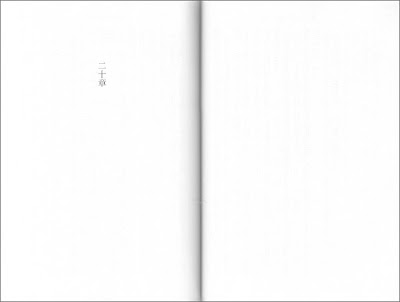
Because the typesetter started each section in Hills of Silver Ruins on the recto, these numbering gaps are scattered throughout the books. Here is the spread for part 20. As you can see, the recto is on the left. The page on the right (the verso of page 59) is blank (click image to magnify).
Typical print book layout also begins front and end material on the recto. But not necessarily chapter headings. A chapter usually gets a new page that is either the next page (recto or verso) or always recto (if saving paper isn't an issue).
In Hills of Silver Ruins, though, chapter headings do not get a new page, only white space. Another clever design decision was to use kanji numbers for the section headings but not the chapter headings. Japanese typography offers these options to book designers and greatly simplifies several other variables.
Characters in a given font and size occupy a box the same width and height, including punctuation. There is no spacing between characters (except in children's books). Imagine typing in a non-proportional font and having the line wrap at the right-hand margin regardless of where the cursor is in a word.
As a result, Japanese typesetters don't have to worry about justification, hyphenation, or widows and orphans (unless the result is quite ungainly, such as a single character on an otherwise blank page).
The one exception is punctuation. An end punctuation mark should not be separated from the preceeding text if it falls at the beginning of a line or the top of a column of text. To prevent this from happening, it is acceptable to kern a punctuation mark or push it into space reserved for the bottom or right margin.
In the example below, you can see the chapter number demarcated only with white space, and a comma and period pushed into the bottom margin. Even rudimentary Japanese word processing software has this capability (click image to magnify).

In vertical text, the comma, period, and close quotation mark (、。」) are located at the top (or left) of the aforementioned box while an open quotation mark (「) is at the bottom (or right). Thus the trailing space is built into the punctuation. Quotation marks rotate 90 degrees when printed vertically.
A paragraph indent is one box wide, the same width (or height) as hitting the spacebar once.
In publishing terms, recto is the front of a leaf (or page) and verso is the back. By tradition, page 1 starts on the recto, the right-hand page in left-to-right languages (such as English). Recto and verso are reversed in right-to-left (vertically typeset) Japanese books, so odd-numbered pages are on the left.
Because the typesetter started each section in Hills of Silver Ruins on the recto, these numbering gaps are scattered throughout the books. Here is the spread for part 20. As you can see, the recto is on the left. The page on the right (the verso of page 59) is blank (click image to magnify).

Typical print book layout also begins front and end material on the recto. But not necessarily chapter headings. A chapter usually gets a new page that is either the next page (recto or verso) or always recto (if saving paper isn't an issue).
In Hills of Silver Ruins, though, chapter headings do not get a new page, only white space. Another clever design decision was to use kanji numbers for the section headings but not the chapter headings. Japanese typography offers these options to book designers and greatly simplifies several other variables.
Characters in a given font and size occupy a box the same width and height, including punctuation. There is no spacing between characters (except in children's books). Imagine typing in a non-proportional font and having the line wrap at the right-hand margin regardless of where the cursor is in a word.
As a result, Japanese typesetters don't have to worry about justification, hyphenation, or widows and orphans (unless the result is quite ungainly, such as a single character on an otherwise blank page).
The one exception is punctuation. An end punctuation mark should not be separated from the preceeding text if it falls at the beginning of a line or the top of a column of text. To prevent this from happening, it is acceptable to kern a punctuation mark or push it into space reserved for the bottom or right margin.
In the example below, you can see the chapter number demarcated only with white space, and a comma and period pushed into the bottom margin. Even rudimentary Japanese word processing software has this capability (click image to magnify).

In vertical text, the comma, period, and close quotation mark (、。」) are located at the top (or left) of the aforementioned box while an open quotation mark (「) is at the bottom (or right). Thus the trailing space is built into the punctuation. Quotation marks rotate 90 degrees when printed vertically.
A paragraph indent is one box wide, the same width (or height) as hitting the spacebar once.
Labels: 12 kingdoms, black moon, japanese, publishing, translations
Comments